Page 49 - Process Book A3_Giacomo Grech
P. 49
-                                -                                           -


                          Google Maps            l b       User Details                         Users Interactions           l b
                                                                                                      iusmo
                                                                                                                     t
                                                                                                                 i
                              iusmo
                                                               iusmo
                              a ore et  o  i  t               a ore et  o  i  t   l b                 a  ore et   o
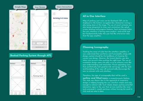
                                                                                                                                           All in One Interface


                                                                                                                                           Map of parking spot area can be displayed. QR can be
                                                                                                                                           displayed in the bottom navigation bar. Animation testing is
                                                                                                                                           also being done at this stage. The use of smart animate was

                                                                                                                                           also being integrated to show such animations like splash
                                                                                                                                           screen, loading and progress features. Such techniques helps
                                                                                                                                           the user interface in having more modern  and stylish look
                                                                                                                                           but fundamentally helps the user feel the interaction style

                                                                                                                                           that the app simplifies.


                                                                                                                                           Choosing Iconography


                                                                                                                                           Tackling the sense of style that the interface simplifies, it


                  Booked Parking System through APS                                                                                        was understood that aesthetics and functionality along with
                                                                                                                                           design context should be the backbone of choosing the
                                                                                                                                           correct icon design. However, the brand identity was also
                                                                                                                                           taken into account when putting the right icons. The use of

                                                                                                                                           minimalist design came into play so as to enhance more the
                                                                                                                                           user understanding and interaction. Visual appealing icons
                                                                                                                                           that aesthetically look good but do not merge with the style
                                                                                                                                           and branding of the app will automatically discourage the
                                                                                                                                           user to interact with such interface.


                                                                                                                                           Therefore, the type of iconography that will be used is

                                                                                                                                           outline and filled icons in monochromatic fashion.
                                                                                                                                           This style was chosen due to the approach of minimalist
                                                                                                                                           design in helping keeping the user interface simple and easy

                                                                                                                                           enough to interact with. Such simple shapes portray powerful
                                                                                                                                           interactive signs to the user that an icon matches the word
                                                                                                                                           and command it visually portrays without having the need to

                                                                                                                                           click and see what it does.


                                                                                                                                                                                                                                      P.49

