Page 55 - Process Book A3_Giacomo Grech
P. 55
Colour Branding & Accessibility


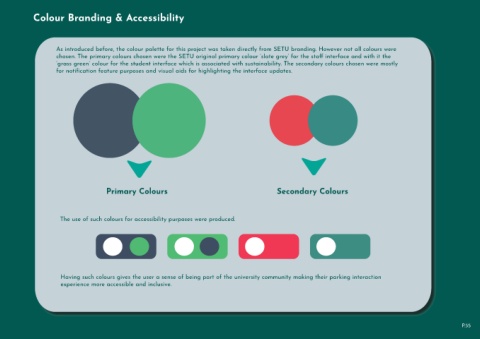
                             As introduced before, the colour palette for this project was taken directly from SETU branding. However not all colours were
                             chosen. The primary colours chosen were the SETU original primary colour ‘slate grey’ for the staff interface and with it the
                             ‘grass green’ colour for the student interface which is associated with sustainability. The secondary colours chosen were mostly
                             for notification feature purposes and visual aids for highlighting the interface updates.


                                                      Primary Colours                                                                     Secondary Colours


                               The use of such colours for accessibility purposes were produced.


                               Having such colours gives the user a sense of being part of the university community making their parking interaction

                               experience more accessible and inclusive.


                                                                                                                                                                                                                                      P.55

