Page 56 - Process Book A3_Giacomo Grech
P. 56
Logo Design


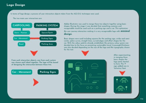
                  In terms of logo design, a process of user interaction objects taken from the A.E.I.O.U. technique were used.


                      The two main user interactions are:


                      CARPOOLING                            PARKING SYSTEM                               Adobe Illustrator was used to merge these two objects together using basic
                                                                                                         shapes. During this stage it was decided that something common and
                                                                                                         recognisable would be used such as a parking sign and a car. This epitomises
                                                                                                         the user journey interaction making it a very recognisable logo with minimal

                        Users - Human                                Spaces/Spots
                                                                                                         design.


                        Car - Movement                              Parking Signs                        Basic shapes were used including squares for the parking sign, circles and semi-
                                                                                                         circles, spline curves, straight lines, curved edges and offset shapes for the

                                Road                                 Parking Area                        car. With the colour palette already established, the primary colour green was
                                                                                                         decided due to the focus on promoting sustainable travel. Lineweight/thickness

                                                                                                         was also decided depending on the size of the logo and the typography chosen
                                                                                                         for the text.


                                                                                                                                                                                           After experimenting
                                                                                                                                                                                           in merging these

                    From such interaction objects, one from each system                                                                                                                    basic shapes the
                    was chosen and linked together. The logo will be based                                                                                                                 logo parts started
                    of designing the interaction between these two.                                                                                                                        to form. The ‘P’
                                                                                                                                                                                           sign added was in
                                                                                                                                                                                           ‘helvetica’ font.

                     Car - Movement                               Parking Signs


                                                                                                                                                                                               P


                                                                                                                                                                                                               P


                                                                                                                                                                                                                                      P.56

