Page 57 - Process Book A3_Giacomo Grech
P. 57

Logo Name & Integration


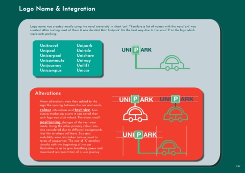
                              Logo name was created mostly using the word ‘university’ in short ‘uni’. Therefore a list of names with the word ‘uni’ was

                              created. After testing most of them it was decided that ‘Unipark’ fits the best way due to the word ‘P’ in the logo which
                              represents parking.


                                        Unitravel                           Unipark
                                                                                                                                   P
                                        Unipool                             Uniride                                    UNI      ARK

                                        Unicarpool                          Unishare
                                        Unicommute                          Uniway


                                        Unijourney                          Unilift
                                        Unicampus                           Unicar


                                   Alterations


                                                                                                                                                                          P
                                                                                                                                  P
                                        Minor alterations were then added to the                                     UNI     ARK                            UNI     ARK
                                        logo like spacing between the car and words,

                                        colour alterations and text size. Also

                                        during marketing assets it was noted that
                                        such logo was a bit robust. Therefore, small

                                        positioning changes of the text were
                                        made. Using the other primary colour was
                                        also considered due to different backgrounds

                                        that the interface will have. Size and                                          UNI     ARK
                                                                                                                                      P
                                        scalability were also taken into account in
                                        terms of proportion. The end of ‘K’ matches
                                        directly with the beginning of the car
                                        illustration so as to give breathing space and

                                        movement representation of a user journey.


                                                                                                                                                                                                                                      P.57
   52   53   54   55   56   57   58   59   60   61   62