
Page 80 - Process_book_Carla Ann_Lloren
P. 80
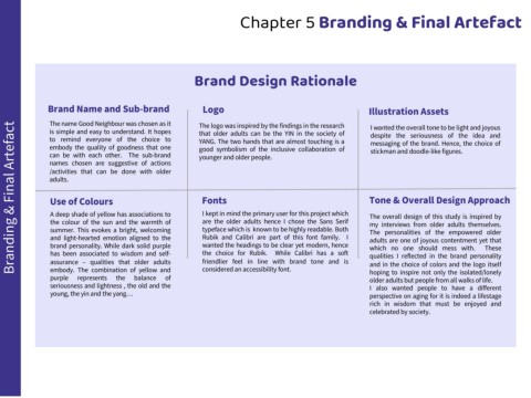
Chapter 5 Branding & Final Artefact


                                                                           Brand Design Rationale


                   Brand Name and Sub-brand                                   Logo                                                           Illustration Assets


                    The name Good Neighbour was chosen as it                 The logo was inspired by the findings in the research            I wanted the overall tone to be light and joyous
      Branding & Final Artefact
                    is simple and easy to understand. It hopes               that older adults can be the YIN in the society of               despite the seriousness of the idea and
                    to remind everyone of the choice to                      YANG. The two hands that are almost touching is a                messaging of the brand. Hence, the choice of
                    embody the quality of goodness that one                  good symbolism of the inclusive collaboration of                 stickman and doodle-like figures.
                    can be with each other. The sub-brand                    younger and older people.
                    names chosen are suggestive of actions
                    /activities that can be done with older
                    adults.


                    Use of Colours                                            Fonts                                                          Tone & Overall Design Approach


                    A deep shade of yellow has associations to                I kept in mind the primary user for this project which         The overall design of this study is inspired by
                    the colour of the sun and the warmth of                   are the older adults hence I chose the Sans Serif              my interviews from older adults themselves.
                    summer. This evokes a bright, welcoming                   typeface which is known to be highly readable. Both            The personalities of the empowered older
                    and light-hearted emotion aligned to the                  Rubik and Calibri are part of this font family. I              adults are one of joyous contentment yet that
                    brand personality. While dark solid purple                wanted the headings to be clear yet modern, hence              which no one should mess with.              These
                    has been associated to wisdom and self-                   the choice for Rubik.      While Calibri has a soft            qualities I reflected in the brand personality
                    assurance – qualities that older adults                   friendlier feel in line with brand tone and is                 and in the choice of colors and the logo itself
                    embody. The combination of yellow and                     considered an accessibility font.                              hoping to inspire not only the isolated/lonely
                    purple    represents     the    balance     of                                                                           older adults but people from all walks of life.
                    seriousness and lightness , the old and the                                                                              I also wanted people to have a different
                    young, the yin and the yang…                                                                                             perspective on aging for it is indeed a lifestage
                                                                                                                                             rich in wisdom that must be enjoyed and
                                                                                                                                             celebrated by society.