Page 75 - Process_book_Carla Ann_Lloren
P. 75

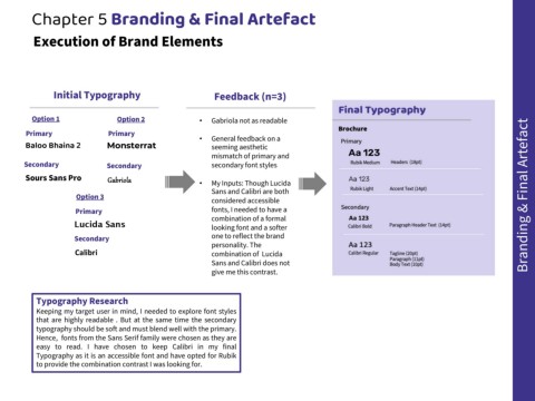
Chapter 5 Branding & Final Artefact


             Execution of Brand Elements


                     Initial Typography                                           Feedback (n=3)


             Option 1                        Option 2                       •    Gabriola not as readable

           Primary                        Primary
                                                                            •    General feedback on a
          Baloo Bhaina 2                 Monsterrat                              seeming aesthetic
                                                                                 mismatch of primary and
          Secondary                      Secondary                               secondary font styles
          Sours Sans Pro                 Gabriola                           •    My Inputs: Though Lucida


                                                                                 Sans and Calibri are both
                              Option 3                                           considered accessible                                                                                                  Branding & Final Artefact


                             Primary                                             fonts, I needed to have a
                                                                                 combination of a formal
                             Lucida Sans                                         looking font and a softer

                             Secondary                                           one to reflect the brand
                                                                                 personality. The
                             Calibri                                             combination of  Lucida

                                                                                 Sans and Calibri does not
                                                                                 give me this contrast.


              Typography Research

              Keeping my target user in mind, I needed to explore font styles
              that are highly readable . But at the same time the secondary
              typography should be soft and must blend well with the primary.
              Hence, fonts from the Sans Serif family were chosen as they are
              easy to read. I have chosen to keep Calibri in my final

              Typography as it is an accessible font and have opted for Rubik
              to provide the combination contrast I was looking for.
   70   71   72   73   74   75   76   77   78   79   80