Page 74 - Process_book_Carla Ann_Lloren
P. 74
Chapter 5 Branding & Final Artefact


             Execution of Brand Elements


                              Initial Colours                                              Feedback (n=3)                                   Iteration on Final Colours


                    Primary Colors                                                       •    Perceived to                                  Primary Colors
     Branding & Final Artefact
                          #FFC000                  #AA9EE1                                    have too much                                       #FFC000                      #3D338B
                                                                                              secondary colors
                                                                                                                                             RGB: 255, 192, 0              RGB: 61, 51, 139
                                                                                         •    Primary colors                                 CMYK : 0, 26, 100, 0          CMYK: 94, 98, 7, 1
                    Secondary Colors                                                          perceived to be
                                                                                              dull when mixed
                           #F1863                  #B31D0f                                    together                                     Secondary Colors

                                                                                                                                                  #AA9EE1                       #FFF2CC
                          #A6A6A6                  #FFFFFF                               •    My Inputs: Seems
                                                                                              too friendly for                              RGB: 170, 158, 225             RGB: 255, 242, 204
                                                                                              the brand                                     CMYK: 33, 37, 0, 0             CMYK: 0, 3, 22, 0
                           0000000                                                            personality

                                                                                                                                                  0000000                      #D9D9D9


                                                                                                                                             RGB: 0, 0, 0                RGB: 217, 217, 217

                                                                                                                                            CMYK: 75, 68, 67,90          CMYK: 14, 10, 11, 0


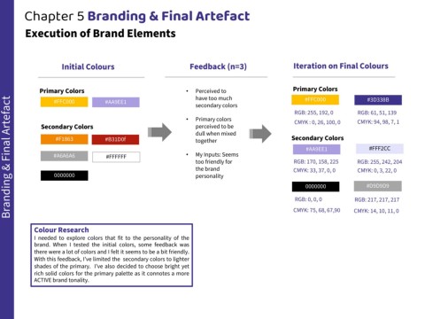
                 Colour Research
                 I needed to explore colors that fit to the personality of the
                 brand. When I tested the initial colors, some feedback was

                 there were a lot of colors and I felt it seems to be a bit friendly.
                 With this feedback, I’ve limited the secondary colors to lighter
                 shades of the primary. I’ve also decided to choose bright yet
                 rich solid colors for the primary palette as it connotes a more
                 ACTIVE brand tonality.

