


Page 180 - MAT KS3 Y8 Cambridge CheckPoint
P. 180
18 Interpreting and discussing results


               When you study statistics, you need to be able to draw and            Key words
               understand charts, graphs, tables and diagrams. This is a very
               important skill. Looking at a ‘picture’ of data makes it easier to see   Make sure you learn and
               what it is showing you.                                              understand these key words:
                                                                                    line graph
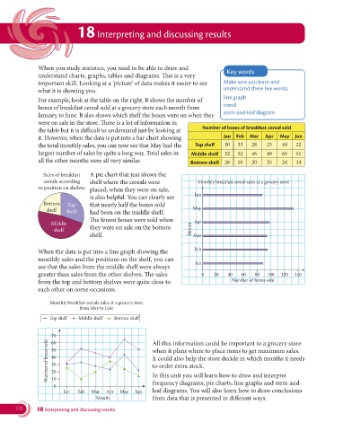
               For example, look at the table on the right. It shows the number of
                                                                                    trend
               boxes of breakfast cereal sold at a grocery store each month from
                                                                                    stem-and-leaf diagram
               January to June. It also shows which shelf the boxes were on when they
               were on sale in the store. There is a lot of information in
                                                                            Number of boxes of breakfast cereal sold
               the table but it is difficult to understand just by looking at
               it. However, when the data is put into a bar chart showing           Jan  Feb  Mar   Apr  May   Jun
               the total monthly sales, you can now see that May had the   Top shelf  30  33   28   23    44   22
               largest number of sales by quite a long way. Total sales in   Middle shelf  32  52  46  40  65  51
               all the other months were all very similar.              Bottom shelf  26  10   20   35    24   14

                 Sales of breakfast  A pie chart that just shows the
                 cereals according  shelf where the cereals were           Monthly breakfast cereal sales at a grocery store
               to position on shelves  placed, when they were on sale,
                                                                         Jun
                                  is also helpful. You can clearly see
                 Bottom   Top     that nearly half the boxes sold
                  shelf   shelf   had been on the middle shelf.          May
                                  The fewest boxes were sold when
                    Middle
                     shelf        they were on sale on the bottom       Month Apr
                                  shelf.                                 Mar


               When the data is put into a line graph showing the        Feb
               monthly sales and the positions on the shelf, you can
                                                                          Jan
               see that the sales from the middle shelf were always
               greater than sales from the other shelves. The sales         0    20   40   60   80  100  120   140
               from the top and bottom shelves were quite close to                     Number of boxes sold
               each other on some occasions.


                    Monthly breakfast cereals sales at a grocery store
                               from May to June
                   Top shelf  Middle shelf  Bottom shelf


                    70                                    All this information could be important to a grocery store
                   Number of boxes sold  50               when it plans where to place items to get maximum sales.
                    60
                    40
                                                          It could also help the store decide in which months it needs
                    30
                                                          to order extra stock.
                    20
                    10
                                                          frequency diagrams, pie charts, line graphs and stem-and-
                     0                                    In this unit you will learn how to draw and interpret
                         Jan  Feb  Mar   Apr  May  Jun    leaf diagrams. You will also learn how to draw conclusions
                                     Month                from data that is presented in different ways.
       178     18 Interpreting and discussing results

