


Page 181 - MAT KS3 Y8 Cambridge CheckPoint
P. 181
18.1 Interpreting and drawing frequency diagrams


               18.1 Interpreting and drawing frequency diagrams


               Frequency diagrams show how often particular values occur in a set of data. One example of a
               frequency diagram is a bar chart. In bar charts, bars can be used to represent frequency.

                When you draw a bar chart for discrete data        When you draw a bar chart for continuous data
                you should make sure that:                         you should make sure that:
                r  the bars are all the same width                 r  the bars are all the same width
                r  there is equal gap between the bars             r  there are no gaps between the bars
                r  you write the data groups under each bar        r  you use a sensible scale on the horizontal axis
                r  you give the frequency diagram a title and      r  you give the frequency diagram a title and
                  label the axes                                      label the axes
                r  you use a sensible scale on the vertical axis.  r  you use a sensible scale on the vertical axis.


                Worked example 18.1
                                                                            Number of pieces of fruit eaten by 8T in one week
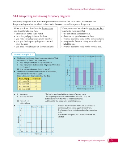
                a  The frequency diagram shows how many pieces of fruit
                   the students in class 8T ate in one week.               10
                   i  How many students ate 4–7 pieces of fruit?
                   ii   How many more students ate 8–11 pieces of fruit than    8
                      12–15 pieces?
                   iii  How many students are there in class 8T?            6
                b  The frequency table shows the masses of 20 teachers,    Frequency
                    measured to the nearest kilogram.
                    Draw a frequency diagram to show the data.              4
                      Mass, m (kg)  Frequency
                      60 < m ⩽ 70      3                                    2
                      70 < m ⩽ 80      8
                                                                            0
                      80 < m ⩽ 90      6                                           0 –3    4–7     8–11   12–15
                      90 < m ⩽ 100     4                                            Number of pieces of fruit

                a  i  6 students                    The bar for 4–7 has a height of 6 on the frequency axis.
                   ii  9 − 4 = 5 students           The frequency for 8–11 is 9 and the frequency for 12–15 is 4.
                                                  Subtract one from the other to find the difference.
                   iii  7 + 6 + 9 + 4               Add together the frequencies for all the groups.
                        = 26 students
                b                                                 The bars are all the same width and, as the data is
                                   Mass of 20 teachers
                                                                continuous, there are no gaps between them.
                      8                                           The horizontal and vertical axes both have a sensible
                                                                scale.
                                                                  The frequency diagram has a title and the axes are
                     Frequency 6                                labelled.

                      4

                      2

                      0
                        50   60   70    80   90   100  110
                                      Mass (kg)


                                                                                     18 Interpreting and discussing results  179

