


Page 185 - MAT KS3 Y8 Cambridge CheckPoint
P. 185
18.2 Interpreting and drawing pie charts


               ✦     Exercise 18.2


               1  The table shows the favourite flavours of ice cream of the 30 students in class 8A.
                      Favourite flavour     Vanilla   Strawberry  Raspberry   Chocolate    Caramel

                    Number of students        6          9           5           8           2
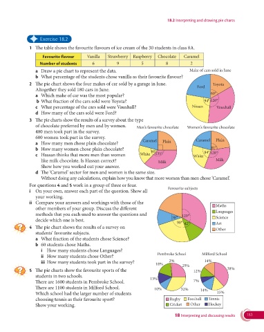
                  a  Draw a pie chart to represent the data.                                 Make of cars sold in June
                  b  What percentage of the students chose vanilla as their favourite flavour?

               2  The pie chart shows the four makes of car sold by a garage in June.                   Toyota
                                                                                                Ford
                  Altogether they sold 180 cars in June.
                                                                                                       60°
                  a  Which make of car was the most popular?
                   b  What fraction of the cars sold were Toyota?                                   94°  126°
                  c  What percentage of the cars sold were Vauxhall?                          Nissan      Vauxhall
                  d  How many of the cars sold were Ford?

               3   The pie charts show the results of a survey about the type
                  of chocolate preferred by men and by women.      Men’s favourite chocolate  Women’s favourite chocolate
                  480 men took part in the survey.
                  600 women took part in the survey.
                                                                      Caramel   Plain           Caramel  Plain
                  a  How many men chose plain chocolate?
                  b  How many women chose plain chocolate?                60°                       84°  81°
                  c   Hassan thinks that more men than women         White  135°              White    120°
                     like milk chocolate. Is Hassan correct?                 Milk                        Milk
                    Show how you worked out your answer.
                  d   The ‘Caramel’ sector for men and women is the same size.
                     Without doing any calculations, explain how you know that more women than men chose ‘Caramel’.
                 For questions 4 and 5 work in a group of three or four.
                                                                                  Favourite subjects
               i   On your own, answer each part of the question. Show all
                  your working.
               ii   Compare your answers and workings with those of the
                                                                                                         Maths
                  other members of your group. Discuss the different
                                                                                                         Languages
                  methods that you each used to answer the questions and                 120 °
                                                                                    38 °                 Science
                  decide which one is best.
                                                                                      90 °  42 °         Art
               4   The pie chart shows the results of a survey on
                                                                                                         Other
                  students’ favourite subjects.
                  a  What fraction of the students chose Science?
                  b  60 students chose Maths.
                     i  How many students chose Languages?
                                                                             Pembroke School       Milford School
                     ii  How many students chose Other?
                     iii  How many students took part in the survey?               2%               14%
                                                                            18%
                                                                                         25%
               5   The pie charts show the favourite sports of the                            12%              38%
                  students in two schools.
                                                                          13%
                  There are 1600 students in Pembroke School.                                 7%
                  There are 1100 students in Milford School.                10%         32%       14%
                    Which school had the larger number of students                                        15%
                  choosing tennis as their favourite sport?                        Rugby    Football  Tennis
                  Show your working.                                               Cricket   Other    Hockey

                                                                                     18 Interpreting and discussing results  183

