


Page 184 - MAT KS3 Y8 Cambridge CheckPoint
P. 184
18.2 Interpreting and drawing pie charts


               18.2 Interpreting and drawing pie charts


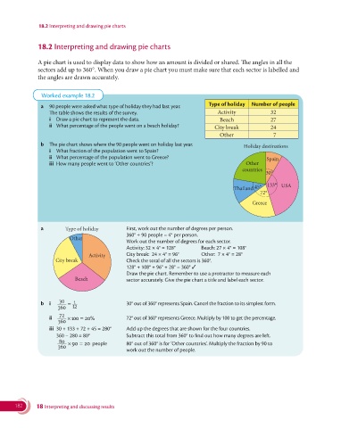
               A pie chart is used to display data to show how an amount is divided or shared. The angles in all the
               sectors add up to 360°. When you draw a pie chart you must make sure that each sector is labelled and
               the angles are drawn accurately.


                Worked example 18.2
                                                                               Type of holiday  Number of people
                a  90 people were asked what type of holiday they had last year.
                   The table shows the results of the survey.                     Activity            32
                   i  Draw a pie chart to represent the data.                      Beach              27
                   ii  What percentage of the people went on a beach holiday?    City break           24
                                                                                   Other               7
                b  The pie chart shows where the 90 people went on holiday last year.       Holiday destinations
                   i  What fraction of the population went to Spain?
                    ii  What percentage of the population went to Greece?                            Spain
                    iii  How many people went to ‘Other countries’?                          Other
                                                                                            countries
                                                                                                    30°


                                                                                         Thailand  45°  133°  USA
                                                                                                  72°
                                                                                               Greece


                a         Type of holiday       First, work out the number of degrees per person.
                                                360° ÷ 90 people = 4° per person.
                           Other
                                                Work out the number of degrees for each sector.
                                                Activity: 32 × 4° = 128°    Beach: 27 × 4° = 108°
                                  Activity      City break:  24 × 4° = 96°   Other:  7 × 4° = 28°
                     City break                 Check the total of all the sectors is 360°.

                                                128° + 108° + 96° + 28° = 360° ✓
                                                  Draw the pie chart. Remember to use a protractor to measure each
                             Beach              sector accurately. Give the pie chart a title and label each sector.


                       30    1
                b  i      =                       30° out of 360° represents Spain. Cancel the fraction to its simplest form.
                       360  12
                       72
                   ii     × 100 =  20%            72° out of 360° represents Greece. Multiply by 100 to get the percentage.
                       360
                   iii  30 + 133 + 72 + 45 = 280°   Add up the degrees that are shown for the four countries.
                      360 − 280 = 80°             Subtract this total from 360° to find out how many degrees are left.
                       80  × 90 =  20  people     80° out of 360° is for ‘Other countries’. Multiply the fraction by 90 to
                       360
                                                work out the number of people.


       182     18 Interpreting and discussing results

