


Page 182 - MAT KS3 Y8 Cambridge CheckPoint
P. 182
18.1 Interpreting and drawing frequency diagrams


               ✦     Exercise 18.1


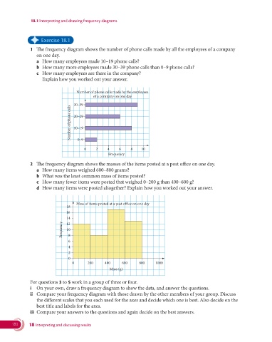
               1   The frequency diagram shows the number of phone calls made by all the employees of a company
                  on one day.
                  a  How many employees made 10–19 phone calls?
                  b   How many more employees made 30–39 phone calls than 0–9 phone calls?
                  c  How many employees are there in the company?
                    Explain how you worked out your answer.


                                     Number of phone calls made by the employees
                                             of a company on one day
                                    30–39
                                  Number of phone calls  20–29


                                    10–19

                                     0–9

                                         0    2    4     6    8    10
                                                    Frequency
               2   The frequency diagram shows the masses of the items posted at a post office on one day.
                  a  How many items weighed 600–800 grams?
                  b   What was the least common mass of items posted?
                  c   How many fewer items were posted that weighed 0–200 g than 400–600 g?
                  d  How many items were posted altogether? Explain how you worked out your answer.


                                     Mass of items posted at a post office on one day
                                18
                                16
                                14
                              Frequency  12 8
                                10

                                 6
                                 4
                                 2
                                 0
                                   0      200     400     600     800     1000
                                                    Mass (g)


                 For questions 3 to 5 work in a group of three or four.
               i   On your own, draw a frequency diagram to show the data, and answer the questions.
               ii   Compare your frequency diagram with those drawn by the other members of your group. Discuss
                  the different scales that you each used for the axes and decide which one is best. Also decide on the
                  best title and labels for the axes.
               iii  Compare your answers to the questions and again decide on the best answers.


       180     18 Interpreting and discussing results

