


Page 186 - MAT KS3 Y8 Cambridge CheckPoint
P. 186
18.3 Interpreting and drawing line graphs


               18.3 Interpreting and drawing line graphs


               A line graph is a series of points that are joined by straight lines.
               They are usually used to show trends, which tell you how data changes over a period of time.
               When you draw a line graph, make sure that:
               r  you put time on the horizontal axis
               r  you use an appropriate scale on the vertical axis
               r  you plot each point accurately
               r  you join the points with straight lines
               r  you give the line graph a title and label the axes.


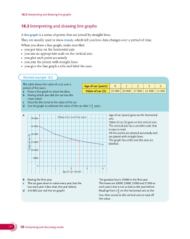
                 Worked example 18.3

                  The table shows the value of a car over a
                                                          Age of car (years)  0      1       2       3      4
                period of five years.
                a  Draw a line graph to show the data.     Value of car ($)  25 000 20 000 17 000 14  900 13 400
                b  During which year did the car lose the
                    most value?
                c  Describe the trend in the value of the car.
                                                              1
                d  Use the graph to estimate the value of the car after 2  years.
                                                              2

                a                                                           Age of car (years) goes on the horizontal
                      30 000            Value of car over five years      axis.
                                                                            Value of car ($) goes on the vertical axis.
                       25 000                                               The vertical axis has a sensible scale that
                                                                          is easy to read.
                       20 000                                               All the points are plotted accurately and
                     Value of car ($)  15 000                             labelled.
                                                                          are joined with straight lines.
                                                                            The graph has a title and the axes are


                      10 000


                       5000

                          0
                                      1         2          3          4
                                           Age of car (years)


                b  During the first year.                              The greatest loss is $5000 in the first year.
                c  The car goes down in value every year, but the      The losses are $5000, $3000, $2000 and $1500 so
                    loss each year is less than the year before.      each year’s loss is not as bad as the year before.
                                                                                1
                d  $16 000 (see red line on graph)                    Read up from 2  on the horizontal axis to the
                                                                                2
                                                                    line, then across to the vertical axis to read off
                                                                    the value.


       184     18 Interpreting and discussing results

