
Page 536 - Basic College Mathematics with Early Integers
P. 536
S E C T ION 7.1 I READING PICTOGRAPHS, BAR GRAPHS, HISTOGRAMS, AND LINE GRAPHS 513
Concept Check Which of the following sets of data is better suited to rep-
resentation by a histogram? Explain.
Set 1 Set 2
Grade on # of Section Avg. Grade
Final Students Number on Final
51–60 12 150 78
61–70 18 151 83
71–80 29 152 87
81–90 23 153 73
91–100 25
Objective Reading Line Graphs
Another common way to display information with a graph is by using a line graph. An
advantage of a line graph is that it can be used to visualize relationships between two
quantities.A line graph can also be very useful in showing a change over time.
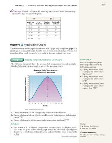
Example 9 Reading Temperatures from a Line Graph PRACTICE 9
Use the temperature graph
The following line graph shows the average daily temperature for each month for
in Example 9 to answer the
Omaha, Nebraska. Use this graph to answer the questions below.
following questions:
a. During what month is the
Average Daily Temperature
average daily temperature
for Omaha, Nebraska
the lowest?
80
b. During what month is the
Temperature (degrees Fahrenheit) 60 c. During what months is the
75
average daily temperature
70
25°F?
65
average daily temperature
55
greater than 70°F?
50
45
40
35
30
25
20
0
J F M A M J J A S O N D
Month
Source: National Climatic Data Center
a. During what month is the average daily temperature the highest?
b. During what month, from July through December, is the average daily temper-
ature 65°F?
c. During what months is the average daily temperature less than 30°F?
Solution: Answers
9. a. January b. December
a. The month with the highest temperature corresponds to the highest point.
c. June, July, and August
This is the red point shown on the graph above. We follow this highest point
downward to the horizontal month scale and see that this point corresponds Concept Check Answer
to July. Set 1; the grades are arranged in ranges
Continued on next page of scores.