
Page 72 - Process Book Abdul Raffai Waqar
P. 72
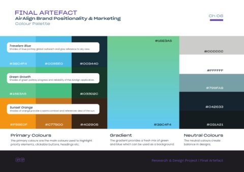
FINAL ARTEFACT

                                                                                                                                                                                                             Ch 06
                AirAlign Brand Positionality & Marketing

                Colour Palette


                                                                                                                                                        #15E3A5

          Travelers Blue

          Shades of blue portray global outreach and give reference to sky view.
                                                                                                                                                                                                        #CCCCCC


          #38C4F4                            #00B5E0                           #003440


                                                                                                                                                                                                           #FFFFFF


          Green Growth
          Shades of green portray progress and reliability of the Airalign application.


                                                                                                                                                                                                          #799FA8


          #15E3A5                            #0AC28D                           #033D2C


           Sunset Orange                                                                                                                                                                                  #042633
           Shades of orange provide a warm contrast and references view of the sun.


           #F59E0F                           #C77B00                           #402905                                                                 #38C4F4                                             #031A21


           Primary Colours                                                                                  Gradient                                                                 Neutral Colours


           The primary colours are the main colours used to highlight                                       The gradient provides a fresh mix of green                               The neutral colours create
           priority elements, clickable buttons, headings etc.                                              and blue which can be used as a background.                              balance in designs.


                                                                                                                                                     Research & Design Project | Final Artefact