
Page 47 - 3D Artist 110 - 2017 UK
P. 47
08
avoiding ‘false details’
Learning how to avoid reliance on ‘false details’ during art
iteration is vital for environment art, but also applies to
character renders, where the image lives or dies on its
readability. False details are any metals, high-frequency
textures or overly relective materials that introduce a lot
of screen-space relections. These elements can be
misleading in analysing models, as they can prematurely
trick you into thinking that your model complexity is
suficient and balanced, when in reality, your eye is
simply trying to parse the noise.
As sections of the character are imported into
KeyShot, each is assigned a basic clay shader to ensure
that the composition is still interesting enough on its
own. Keeping the materials simple at this phase
facilitates decisions about where to add complexity, and
where the detail is truly suficient and complete.
Your art will hold up better over time if the details are
true, static and intended, while using relections and
09
renderer details as a layer of polish.
Decals in KeyShot Since KeyShot’s decal system is
08 amazingly user-friendly, it’s very useful for illing the
gaps in areas that need additional detail. Each decal is worked
up in a basic TGA output from Photoshop. Once decals are
built, there are some tricks to help with believability. First,
create a 5% opaque duplicate of the decal, and apply a low-
intensity halftone ilter. Next, create a low-intensity Gaussian
blur duplicate. Overlay both, and be sure to also pull these into
the alpha channel. The purpose of this is so that as KeyShot
processes the image, the edges of the decals will sit, especially
on clean surfaces, much more naturally. As a rule, decal values
should never go fully black or fully white; yes, that old digital art
adage is still important!
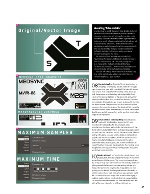
Decal cohesion and storytelling Using decals as a
09 method of detail addition is great, but it’s also
important for believability. For this character, each
manufacturer decal was built with the narrative in mind. The
10
demarcations, designations, fonts and shape language were all
planned out to be consistent, so that the pieces looked like they
belong in the same universe. One level above manufacturer
graphics are the corporate logos. While the protective shells
may be manufactured by one company, and the optics
assemblies were created by another, all were uniied by the
overall MedSync corporate visual aesthetic. By investing some
thought into building consistency into the graphic design, the
results feel more believable.
Render settings If you’re going for a single shot as your
10 presentation, it makes sense to familiarise yourself with
render features. Unlike some of the more complex renderers
like V-Ray or Vue, KeyShot is optimised for usability. It contains
lighting presets that are worth experimenting with early, as
these will prescribe not only how the image lights, but how
quickly you can iterate. Another great feature is the ability to
tell the renderer how much time or how many samples you’d
like it to dedicate to your image. This is useful when trying to
maintain quality without needing to dive into manual sliders.
I’ve found that excellent results can be achieved by manually
setting Maximum Samples to 500, and letting it run.
47
47