
Page 231 - Six Sigma Advanced Tools for Black Belts and Master Black Belts
P. 231
August 31, 2006
3:4
Char Count= 0
JWBK119-14
216 Data Transformation for Geometrically Distributed Quality Characteristics
X^(1/4)
180
160
140
120
100
80
60
40
20
0
0.0 0.4 0.8 1.2 1.6 2.0 2.4 2.8 3.2 3.6 4.0 4.4 4.8 5.2 5.6
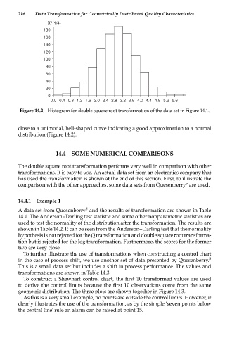
Figure 14.2 Histogram for double square root transformation of the data set in Figure 14.1.
close to a unimodal, bell-shaped curve indicating a good approximation to a normal
distribution (Figure 14.2).
14.4 SOME NUMERICAL COMPARISONS
The double square root transformation performs very well in comparison with other
transformations. It is easy to use. An actual data set from an electronics company that
has used the transformation is shown at the end of this section. First, to illustrate the
5
comparison with the other approaches, some data sets from Quesenberry are used.
14.4.1 Example 1
5
A data set from Quesenberry and the results of transformation are shown in Table
14.1. The Anderson--Darling test statistic and some other nonparametric statistics are
used to test the normality of the distribution after the transformation. The results are
shown in Table 14.2. It can be seen from the Anderson--Darling test that the normality
hypothesis is not rejected for the Q transformation and double square root transforma-
tion but is rejected for the log transformation. Furthermore, the scores for the former
two are very close.
To further illustrate the use of transformations when constructing a control chart
in the case of process shift, we use another set of data presented by Quesenberry. 5
This is a small data set but includes a shift in process performance. The values and
transformations are shown in Table 14.3.
To construct a Shewhart control chart, the first 10 transformed values are used
to derive the control limits because the first 10 observations come from the same
geometric distribution. The three plots are shown together in Figure 14.3.
As this is a very small example, no points are outside the control limits. However, it
clearly illustrates the use of the transformation, as by the simple ‘seven points below
the central line’ rule an alarm can be raised at point 15.