


Page 32 - Handout of Rreport Writting
P. 32
Faculty of Engineering


               2.5 Importance of Using Graphs in Presentations )ةينايبلا تاموسرلا ةيمهأ(


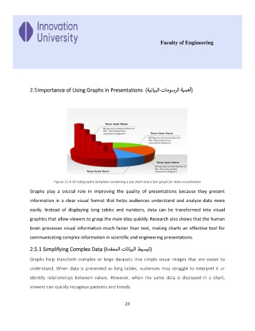
                           Figure 12 A 3D infographic template combining a pie chart and a bar graph for data visualization

               Graphs  play  a  crucial  role  in  improving  the  quality  of  presentations  because  they  present
               information in a clear visual format that helps audiences understand and analyze data more

               easily.  Instead  of  displaying  long  tables  and  numbers,  data  can  be  transformed  into  visual

               graphics that allow viewers to grasp the main idea quickly. Research also shows that the human

               brain processes visual information much faster than text, making charts an effective tool for
               communicating complex information in scientific and engineering presentations.


               2.5.1 Simplifying Complex Data ( ةدقعملا تانايبلا طيسبت     (

               Graphs  help transform  complex  or  large  datasets  into  simple  visual  images  that  are  easier  to

               understand. When data is presented as long tables, audiences may struggle to interpret it or
               identify  relationships  between  values.  However,  when  the  same  data  is  displayed  in  a  chart,

               viewers can quickly recognize patterns and trends.


                                                             23

