


Page 29 - Handout of Rreport Writting
P. 29
Faculty of Engineering


               2.4.1Types of Graphs Used in Presentations  ( ضورعلا ف ةمدختسملا ةينايبلا موسرلا عاونا

                 ةيميدقتلا)

                                     ر

               2.4.1.1.Bar Chart  )طىشلا ئايبلا مسرلا(


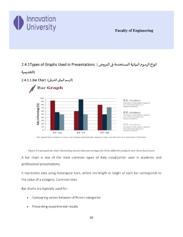
                    Figure 9 A grouped bar chart illustrating annual sales percentages for three different products over three fiscal years

               A  bar  chart  is  one  of  the  most  common  types  of  data  visualization  used  in  academic  and

               professional presentations.


               It represents data using rectangular bars, where the length or height of each bar corresponds to
               the value of a category. Common Uses


               Bar charts are typically used for:


                   •  Comparing values between different categories


                   •  Presenting experimental results


                                                             20

