
Page 11 - Basic Statistics
P. 11
6
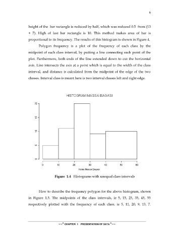
height of the bar rectangle is reduced by half, which was reduced 0.5 from (13
+ 7). High of last bar rectangle is 10. This method makes area of bar is
proportional to its frequency. The results of this histogram is shown in Figure 4.
Polygon frequency is a plot of the frequency of each class by the
midpoint of each class interval, by putting a line connecting each point of the
plot. Furthermore, both ends of the line extended down to cut the horizontal
axis. Line intersects the axis at a point which is equal to the width of the class
interval, and distance is calculated from the midpoint of the edge of the two
classes. Interval class is meant here is two interval classes left and right edge.
Figure 1.4 Histograms with unequal class intervals
How to describe the frequency polygon for the above histogram, shown
in Figure 1.5. The midpoints of the class intervals, ie 5, 15, 25, 35, 45, 55
respectively plotted with the frequency of each class, ie 5, 11, 20, 9, 13, 7.
~~* CHAPTER 1 PRESENTATION OF DATA *~~