


Page 192 - MAT KS3 Y8 Cambridge CheckPoint
P. 192
18.5 Drawing conclusions


                 For question 4 work in a group of three or four.
               i  On your own, answer each part of the question.
               ii   Compare your descriptions, answers and explanations with those of the other members
                  of your group.
                    Discuss the different descriptions and explanations you gave and decide which ones are best.

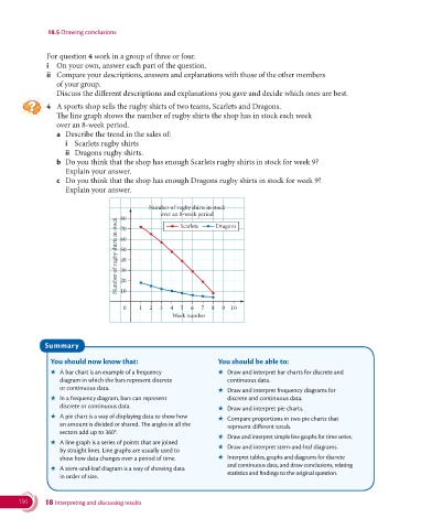
               4   A sports shop sells the rugby shirts of two teams, Scarlets and Dragons.
                    The line graph shows the number of rugby shirts the shop has in stock each week
                  over an 8-week period.
                  a  Describe the trend in the sales of:
                     i  Scarlets rugby shirts
                     ii  Dragons rugby shirts.
                  b   Do you think that the shop has enough Scarlets rugby shirts in stock for week 9?
                    Explain your answer.
                  c   Do you think that the shop has enough Dragons rugby shirts in stock for week 9?
                    Explain your answer.


                                              Number of rugby shirts in stock
                                                  over an 8-week period  Dragons
                                      80
                                    Number of rugby shirts in stock  60
                                                        Scarlets
                                      70

                                      50
                                      40
                                      30
                                      20
                                      10


                                      0    1  2  3   4  5  6  7  8  9  10
                                                     Week number


               Summary

                You should now know that:                          You should be able to:
                ★   A bar chart is an example of a frequency       ★   Draw and interpret bar charts for discrete and
                   diagram in which the bars represent discrete       continuous data.
                   or continuous data.                             ★   Draw and interpret frequency diagrams for
                ★   In a frequency diagram, bars can represent        discrete and continuous data.
                   discrete or continuous data.                    ★   Draw and interpret pie charts.
                ★   A pie chart is a way of displaying data to show how    ★   Compare proportions in two pie charts that
                   an amount is divided or shared. The angles in all the   represent different totals.
                   sectors add up to 360°.
                                                                   ★   Draw and interpret simple line graphs for time series.
                ★   A line graph is a series of points that are joined
                   by straight lines. Line graphs are usually used to    ★   Draw and interpret stem-and-leaf diagrams.
                   show how data changes over a period of time.    ★   Interpret tables, graphs and diagrams for discrete
                                                                      and continuous data, and draw conclusions, relating
                ★   A stem-and-leaf diagram is a way of showing data
                                                                      statistics and findings to the original question.
                   in order of size.


       190     18 Interpreting and discussing results

