
Page 282 - C:\Users\azizu\Documents\Flip PDF Professional\Matematics-Form-1-1\
P. 282
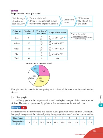
Steps to construct a pie chart:

                  Find the angle    Draw a circle and                                                                                                  Label each   Write down
                  of sector for     divide it into different sectors    sector.        the title of the
                  each category.    based on the angles calculated.                    pie chart.


                  Colour of   Number of    Fraction of   Angle of the sector
                     cars        cars       the circle                         Angle of the sector
                                                9        9                       Frequency of data
                     Red           9                        × 360° = 90°       =                  × 360°
                                               36        36                       Total frequency
                                               12        12
                    Yellow        12                        × 360° = 120°
                                               36        36
                                               10        10
                    White         10                        × 360° = 100°
                                               36        36
                                                5        5
                     Blue          5                        × 360° = 50°
                                               36        36
                    Total         36            1              360°

                                 Sales of Cars of Dynamic Model

                                         Blue
                                                 Red
                                           50°
                                        100°
                                    White     120°
                                               Yellow


                 This pie chart is suitable for comparing each colour of the cars with the total number
                 of cars.

                 (c)  Line graph
                      A line graph is a data representation used to display changes of data over a period     CHAPTER
                 of time. The data is represented by points which are connected in a straight line.
                                                                                                              12
                             6

                 The table shows the temperature of a patient over a particular period of time. Construct a
                 line graph to represent the data and justify the appropriateness of the data representation.

                  Time (a.m.)     1      2       3      4      5      6      7       8      9     10
                  Temperature
                      (°C)       37.8   37.9   38.2   38.4    38.2   37.9   37.9   37.6   37.6    37.5


                                                                                                       271
                                                                                   Data Handling


       12 TB Math F1.indd   271                                                                       11/10/16   12:21 PM