
Page 283 - C:\Users\azizu\Documents\Flip PDF Professional\Matematics-Form-1-1\
P. 283
Steps to construct a line graph:
Plot the
Draw the Choose a suitable and uniform points and Write
horizontal and scale for both axes. The vertical connect the down the
vertical axes on axis represents data. The points in a title of the
a grid. horizontal axis represents time. line graph.
straight line.
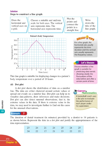
Patient’s Body Temperature
38.4
For a line graph, the
38.2 horizontal axis usually
Temperature (°C) 38.0 duration and the vertical
represents the time
axis usually represents
37.8
the frequency values.
37.6
37.4
Discuss whether a line
0
1 2 3 4 5 6 7 8 9 10 graph is suitable for
Time (a.m.) • predicting data trends.
• showing clearly the
This line graph is suitable for displaying changes in a patient’s fluctuations of the
body temperature over a period of 10 hours. data before and after a
certain point of time.
(d) Dot plot
A dot plot shows the distribution of data on a number
line. The data are either clustered around certain values or
spread out evenly on a number line. Dot plot can help us to
visualise data patterns, draw inferences and make decisions. A basketball coach uses
Dot plot can also detect unusual observations, that is, the a dot plot to evaluate
the performance of
extreme values in the data. If there is extreme value in the each player under
data, we may need to investigate further to find out the cause his supervision.
for the unusual observations.
CHAPTER
12
7
The duration of dental treatment (in minutes) provided by a dentist to 14 patients is
as shown below. Represent the data in a dot plot and justify the appropriateness of the
data representation.
23 24 21 24 25 24 25
24 22 17 21 23 22 23
272
Chapter 12
12 TB Math F1.indd 272 11/10/16 12:21 PM