
Page 288 - C:\Users\azizu\Documents\Flip PDF Professional\Matematics-Form-1-1\
P. 288
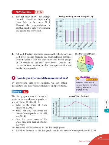
Self Practice      12.1c

                 1.  The  bar chart  shows the average         Average Monthly Rainfall of Impian City
                     monthly rainfall  of Impian City           400
                     from July to  December 2015.
                     Convert  the representation  to            300
                     another suitable data representation
                     and justify the conversion.              Average rainfall (mm)  200
                                                                100


                                                                  0
                                                                      July  August  September  October  November  December

                                                                                 Month

                 2.  A blood donation campaign organised by the Malaysian      Blood Groups of Donors
                     Red Crescent has received  an overwhelming  response             B
                     from the public. The pie chart shows the blood groups           20%    A
                     of 25 donors in the  first three hours. Convert this                  28%
                     representation to another suitable data representation and      O      AB
                     justify the conversion.                                         36%    16%


                      How do you interpret data representations?                    LEARNING
                                                                                          STANDARDS
                 By  interpreting data representations, we can obtain           Interpret various data
                                                                                representations including
                 information and hence make inferences and predictions.
                                                                                making inferences
                                                                                or predictions.
                             11


                 The  line graph shows  the mass of                      Mass of Waste Produced
                 waste, in thousand tonnes, produced          3
                 in a city from 2010 to 2015.
                 (a)  What  is  the  mass  of  waste          2                                               CHAPTER
                     produced in 2010?                     Mass of waste   (thousand tonnes)
                 (b)  What  can you say about the             1                                               12
                     mass of waste produced in 2011
                     and 2014?                                0
                 (c)  Find the mean mass of the                    2010 2011 2012 2013 2014 2015
                                                                                 Year
                     waste produced over a period of
                     six years.
                 (d)  State one inference based on the line graph given.
                 (e)  Based on the trend of the line graph, predict the mass of waste produced in 2016.


                                                                                                       277
                                                                                   Data Handling


       12 TB Math F1.indd   277                                                                       11/10/16   12:21 PM